Sunday, 20 July 2014

The Antique Peter Pan Guide - editions by Rackham & F.D Bedford - An Antique Books Guide


Peter Pan is one of the most renowned children's story, telling the tale of a boy who never grows up and spends his time exploring the island of Neverland with his band of Lost Boys. It is also one of the most collectable antique children's books, having spawned many different editions, illustrated by some of the finest illustrators around, from Mabel Lucie Attwell to Arthur Rackham.


This blog post focuses on the five most collectable illustrated editions, each showcasing unique presentation and beautiful illustrations.


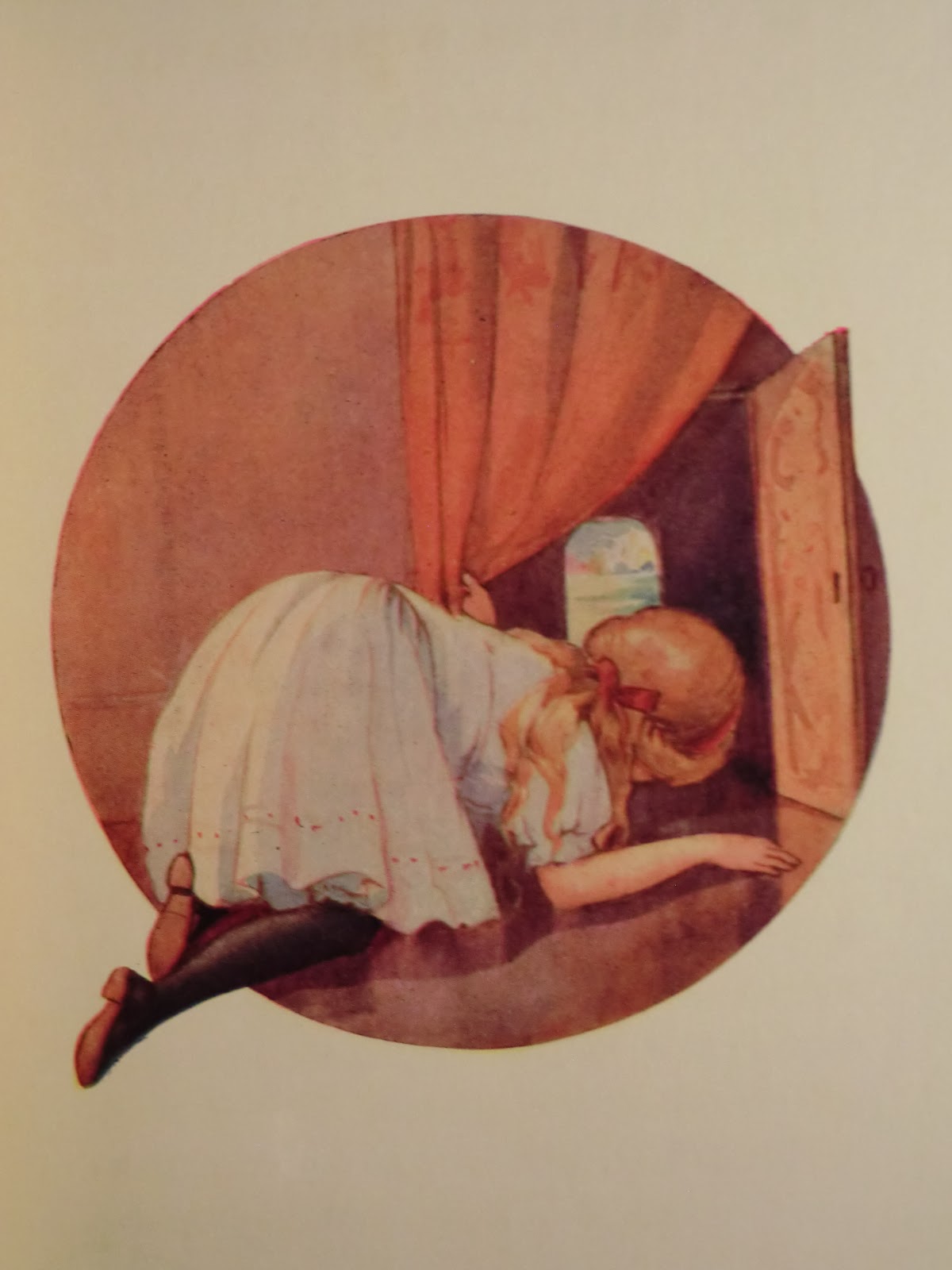
1. Arthur Rackham - First Edition 1906
Value - £250 plus for the 1906 first edition and as low as £100 for a worse condition 1907 or 1908 edition
Positive - A luxurious, high quality edition that showcased some of Rackham's finest work
Negative - All plates except for the frontispiece were printed on grey card at the back of the book so don't really flow with the reading experience
This is the edition to own if you are seeking a truly iconic edition. Being the first edition illustrated by renowned Golden Age illustrator Arthur Rackham is impressive enough but with fifty plates of illustrations and a remarkable presentation quality, this lovely book is a perfect example of why children's books are so collected. 
 A vellum deluxe edition was also published in this form, for those with an extensive budget.


2. Arthur Rackham 'Best' Edition 1912
Value
- From £300 for a top quality edition to £100 for a poor quality edition                                                                Positive- Features all the original plates interspersed throughout unlike the first Rackham edition for a better reading experience and covers are more decorative                                     Negative - Front/ endpapers do not feature the iconic map plus not classed as 'the original edition'.                                                                                                                                               This lovely 'new' edition is actually larger and preferred by some collectors over the first edition. With the same plates and presentation values but only one year of publication, this version features the illustrations spread throughout the book for a better reading experience.                                                                    A slightly rarer edition which again is available in a deluxe edition for the discerning collector


Arthur Rackham c1912 edition
Value - Up to £200 in some cases but usually between £50 and £100 condition dependent
Positive - A more compact edition that still features 24 different Rackham plates and the map front/ endpapers
Negative - Later and smaller than the original with less than half the plates

Here is a slightly cheaper edition, usually placed at circa 1912. With a high-quality presentation but on a slightly smaller scale, this lovely edition is a tad more affordable. With only half the original illustrations, this is a more compact Rackham edition and can be obtained with red covers in smaller form still.


F.D Bedford First Edition - c1911
Value - From £100 for a later impression and up to £250 for a first impression
Positive- Beautiful gilt covers look great on a bookshelf plus illustrations are more intricate and less mainstream than Rackham's.
Negative - Smaller than Rackham's editions and with less illustrations                                                                           Telling the story of Peter Pan when he meets Wendy, this edition is nearly as collectable as Rackhams. Known for the beautiful F.D Bedford plates which are monochrome and feature immense detail and charm, this edition is beautiful from cover to cover. The first edition features no date and a black/ white frontispiece whilst later impressions (as far as fourth) display the publishing date and can feature a colour frontispiece.


F.D Bedford Colour Frontis edition c1920
Value - Between £60 and £120 although obscure so few sales t base figures upon                                                                 Positive - Simpler in design and comes with the incredibly rare colour frontispiece illustration                                           Negatives - Less ornate and attractive than the first edition    This rare edition is very obscure and is perhaps rarer than the F.D Bedford first edition. Despite this it is considerably less valuable and less sought after. I consider this one a hidden gem however, for the covers may appear simple and plain compared to the first edition but the inside more than makes up for it. Featuring all the same illustrations as the original, this edition also features the incredibly rare colour plate frontispiece, printed on grey card and considerably valuable. 


Of all the editions the Rackham first is most sought after but many admire the F.D Bedford editions for their understated beauty and ornate patterning.

Whether you prefer Rackham or Bedford, or maybe the Mable Lucie Attwell edition, one thing is certain: this is one of the best illustrated children's books and a real key book for collectors, fans of literature and illustration or those wanting a trip down Memory Lane.

 Thank you for reading and please +1, share and comment if you have the time!


Tuesday, 15 July 2014

The Golden Age Illustrators - Arthur Rackham and more (An Antique Books Guide)


The Golden Age Illustrators

Illustration has always enhanced book, especially for younger or wider audiences but between the 1880's and the 1920's a supreme level of illustration was put into all manner of children's stories from Alice in Wonderland to Peter Pan.
This era became known as the Golden Age due to the immense quality and sheer scale of children's book illustration and now represents one of the most collected era of antique books.

Below is a guide of the top ten most renowned illustrators from this era with examples of their work

1. Arthur Rackham

1867-1939

Main years of work: 1900-1920

Arthur Rackham is possibly the most famous book illustrator around.
His work is often designed with muted colours and appears to transcend the simple and often childish narratives of the stories he illustrated, harking back to Nordic designs and Asian inspirations.
Most famously he illustrated J.M Barrie's 'Peter Pan' and Lewis Carroll's 'Alice in Wonderland'.
Any book pre 1940 with his illustration is valuable, with signed copies selling for thousands.


2. Kay Nielsen
1886-1957
Main years of work: 1910-1930

Kay Nielsen is lesser known than Arthur Rackham, solely because he illustrated less popular books.
His most famous work was his illustration for Hans Andersen's fairy tales which appears to include art-deco design with an ethereal quality that puts his work on the same level as Rackham in terms of maturity.
Similar to Rackham, Nielsen's work s are very sought after.


3. Edmund Dulac
1882-1953

Main years of work: 1900-1930

Edmund Dulac is one of the top Golden Age artists and died whilst illustrating a book.
Best known for his illustrations in various Fairy Tales books and 'The Rubaiyat of Omar Khayyam' , his illustrations are often dream-like and show some influence from Arthur Rackham.
He championed the 'tipped in' method of illustration by which illustrations could be inserted into pages rather than being bound, making his work some of the most printable of the early 1900's.


4. Walter Crane
1845-1915

Main years of work:  1865-1900

Walter Crane's work is some of the most iconic of all the Golden Age illustrators due to its bold Arts and Crafts designs.
Preferring fantasy scenes rather than reality, Crane is best known for his nursery books which display a unique Asian/ Italian/ Greek blend of styles.
He also pioneered political art and social art (the re-introduction of art to everyday objects such as carpet) and is a revered name among book collectors.


5. Harry Rountree

1878-1950
Main years of work: 1900-1930

Harry Rountree is best known for his work in 'Alice in Wonderland' although he illustrated many books including those by Enid Blyton and he created honest and colourful illustrations that were more in keeping with the book than Rackham's or similar offerings by other illustrators.
His style was more traditional and akin to watercolour rather than the Asian woodblock design pioneered by his fellow Golden Age illustrators.


6. John Tenniel (Sir)
1820-1914

Main years of work: 1860-1880

Tenniel is another illustrator best known for his work in 'Alice in Wonderland' although he also worked on the well-known 'Punch' magazine series.
His illustrations were originally black and white and in the style of sketch-work.


7. Harry G. Theaker

1873-1954
Main years of work: 1920-1930

Theaker was a lesser-known illustrator but contributed to several children's books including 'The Water Babies'. His work cleverly played with space, making good use of basic shapes such as circles and squares and breaking their boundaries to create innovative illustration.


8. Margaret Tarrant

1888-1959
Main years of work: 1910-1930

Margaret Tarrant helped to single-handedly popularise fairies through her children's book illustration but is best known, as with many others of the Golden Age, for illustrating 'Alice in Wonderland'.
Her illustrations capture the energy and charm of the story with bold water-colour styled designs.


9. Charles Robinson
1870-1937

Main years of work: 1890-1910

This active painter was a popular choice for children's illustration, having illustrated 'The Secret Garden', 'Alice in Wonderland' and 'Grimm's Fairy Tales' among other titles.
His work is similar to Rackham's but often less sober with a little more colour and more of the expected level of energy and style that one might expect from a children's book illustrator.


 10. Kate Greenway

1846-1901

Main years of work: 1880-1900


This list couldn't be written without including Kate Greenway.
Greenway was around before many of the top illustrators and so pioneered children's book illustration through her charming, pastel coloured drawings.
Most notable for her Birthday Book, Greenway created a benchmark that many strove to beat.


And there we have it!


Thanks for reading and lease share/ comment if you enjoyed reading this post.

Monday, 14 July 2014

Ancient Books - Pre 1700 - An Antique Books Guide


Antique books are all very well but ancient books are where true history lies.
Usually I define books (and all sorts of objects for that matter) in the following age brackets:

Modern - 1990 onwards
Retro - 1970-1989
Vintage - 1930-1969
New Antique - 1910's-1929
Antique - 1850-1910's
Old Antique - 1750-1849
Ancient - earlier than 1750

For this post I shall be looking at a single book I have recently looked after - dating from 1581 and thus firmly in what I would class as the ancient bracket.

This post is primarily photo based - for those who haven't seen a book this old before.
I do also want to show some of the most interesting features of such an old book and so will comment below photos for detail.

Details:
Tertia Pars Summae Sacre + Sum Commenatriis, S. Thomae & D. Thomae, Lugduni, 1581, 748pp

* Gilt decorated spine


* Title page with woodcut illustration and inked out inscription


* Title page close-up


* Here is the most notable feature - a stunning arcane illuminated letter


* Surprisingly decorative - note further illustration around the letter 'V'


* Full-size folio page with further illumination

This is a large but atypical 'ancient' volume, showing basic illustration and frequent illumination to key letters.

Stay tuned for more new posts coming soon.

Thanks for reading and please share if this interested you!


Wednesday, 9 July 2014

The Art of J.R.R Tolkien - The Hobbit and more (An Antique Books Guide)


The Art of Tolkien

J.R.R Tolkien is best known for his world-famous fantasy world - Middle Earth. His 'big four' books (The Hobbit and the Lord of the Rings trilogy) have sold more than 250 million copies combined, making him one of the most popular authors the world has ever seen.

Sadly, this popularity has overshadowed a skill that few people know of - his skill as an artist.
J.R.R Tolkien in fact illustrated The Hobbit and created the now iconic dust-jacket design as well as the numerous maps and designs that go with the series.

Below I have collected a range of images from his books (all from my own collection) in the hope that I can enlighten just a few people to the skills of this multi-talented legend.


The Iconic Hobbit Dust-jacket

This famous design was first used in 1937 when the book was originally released and has been used for many different editions and is still being used to this day. The simple colours reflected the cost of print in the 1930's, meaning that the more colours, the more expensive the printing costs.
And yet that is what makes the design so striking, for it simple shows the misty-mountains and sweeping forest that many associate with the world of Middle-Earth.

The Map of Middle Earth

Another fairly renowned illustration of Tolkien's is the map of Middle Earth which features all of the assets of modern fantasy including mountains, a compass and a dragon as well as mysterious names like 'The Misty Mountains'.
This is true fantasy gold.


Hobbiton-across-the-water

This plate is the original frontispeice of early editions of The Hobbit and is still used today. This single scene effectively summarises the peace and tranquility of the Shire. Reminiscent of the English countryside where Tolkien found influence, this illustration is one of his brightest and is a true joy to behold.
If one example of Tolkien's artistic prowess were to be called for, this would be it.


Various Other scenes from The Hobbit:

These four illustrations all show various aspects of Tolkien's skill. The Rivendell scene is reminiscent of the Hobbiton-across-the-water scene but with the sculptured and rather fantastic mountain faces added.

The eagle scene is perhaps the most unique of the illustrations found in The Hobbit for it's harsh, bright colours and angry Eagle focus. Yet as ever the mountains are in the background and firmly place this scene in Middle Earth.

The Smaug scene below is another classic and was in fact used in a modern edition for the cover design. Here is anther unique illustration for its childish simplicity and bright colours.

And lastly the black and white illustration of Bilbo's Hobbit-hole. This is the last illustration in the book and firmly closes the tale to the reader by entering into the Hobbit's domain. The glimpse of Middle Earth outside of the hobbit-hole reminds us of the journey that has been and gone and makes this one of Tolkien's cleverest illustrations.


The 'secret' illustrations

Included in the 1987 edition of The Hobbit were a few extra illustrations collected by Tolkien's son. These are all line-drawings and far more simple than the colourful plates previously noted. Yet they strike to the bare bones of his fantastic creation more effectively and are very interesting for the advanced reader.


The Map
Tolkien was adept too at map-drawing and quite convincingly created the contour-map for Middle Earth. Below is a zoomed-in section just to show the exacting measures he applied to all of his work.


Mr Bliss

This more recent book was only published in the early 1980's and was published on the merit of Tolkien's illustration alone, from an original manuscript discovered by Christoper Tolkien. Tolkien left a mighty collection of background information and scene-setting regarding Middle-Earth, enough to create a ten-book series in fact as his son actually did. However, this charming tale is more important to this post for its artistic value.
Charming and nostalgic.


And that brings this post to an end.
I hope that I managed to impress upon you at least a little of Tolkien's skill as an artist and if you ever read The Hobbit again, maybe take a moment to appreciate the illustrations as well aa the story.

Thanks for reading and as ever please share and comment if possible!